Applying Custom CSS Classes
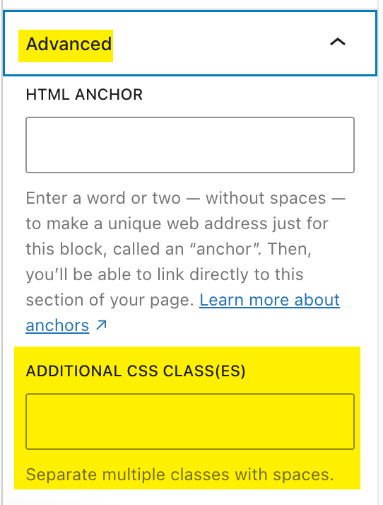
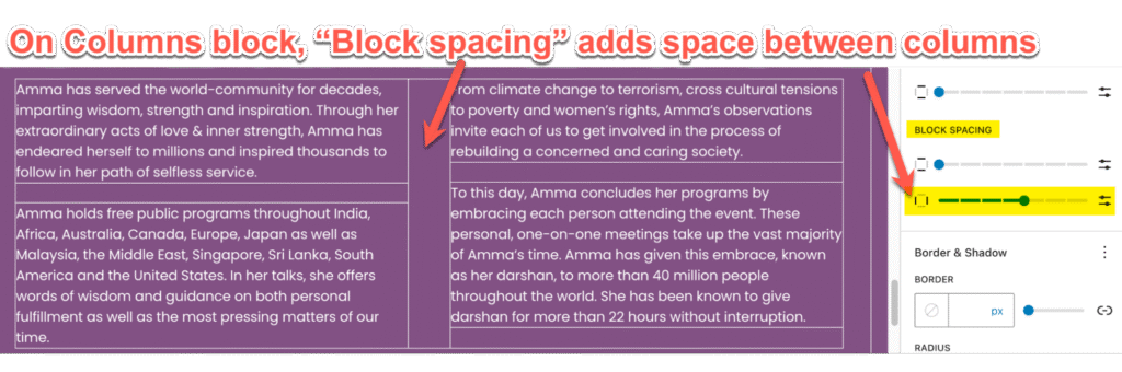
To apply a custom class (also called a style) in Gutenberg, select the block you want to affect and look in the right column (the inspector sidebar) for Block > Advanced > Additional CSS Class(es)
Notes:
- Some blocks will not allow css classes
- Some classes need to be applied to the parent block to affect the contents (children) of the parent
Basic styles
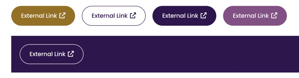
external-link // Add icon to buttons for external links (use on Button block). Visible only on the front end, not in the editor.
is-flex-centered // This will center most things on mobile without affecting the desktop view.
mobile-text-left or mobile-text-right // This will adjust text only on mobile (i.e. text-align:left)
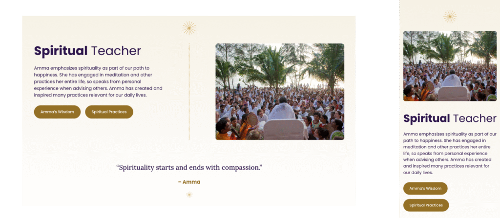
reverse-col or reverse-row // used on a parent container (mostly the columns block or stack block) to reverse the order of its children on mobile (1024px). Note we forced the photo to come first on mobile:
hide-me // Sets “display: none” on any block so you can temporarily hide it instead of deleting it.
mobile-hide-me // Same as above but hide on mobile only (max-width: 767px)
desktop-hide-me // Same as above but hide on desktop only (min-width: 768px)
links-no-underline // remove underlines on any link that has this class
rounded-corners // i.e. used on the Stack block of cards. It rounds all corners in such a way that the top photo actually gets rounded corners WITHOUT having to round the corners manually for each photo.
News/Blog posts CSS
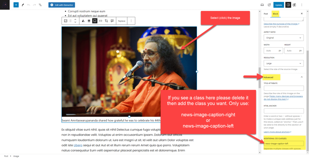
Please do this if you have a nice image and caption that you want to make a bit more important or special: Add a custom CSS class under “Advanced” in the right column. To do this you need to select the image (so the image block settings are shown in the right column) like this below. You will not see any change in the edit screen, but you will see it in the live or previewed post. You can add one of two classes:
news-image-caption-left
news-image-caption-right
Here’s an example. You must select (click) the image before you can add the class.
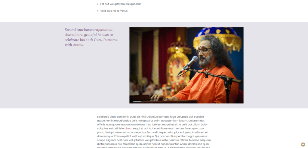
Then on the live article it will look very nice, like this below. (If you have several nice single images with good captions, separated by two paragraphs (or one long paragraph) you should alternate left/right or right/left as you go down the page.)
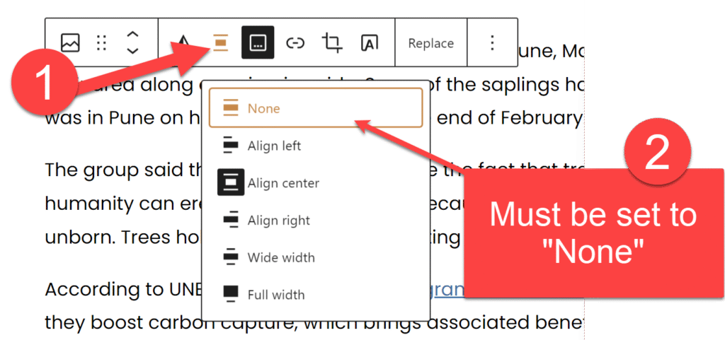
If your caption looks broken, be sure to check this:
Less-common, more technical styles
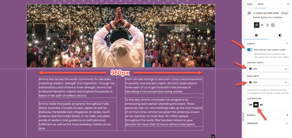
How to create narrower centered content below a wider element (same as above) without using a style:
no-mobile-padding-LR // This will remove padding left/right on mobile if you are really stuck, but you should be using the technique directly above instead, so you do not need to remove any padding on mobile.
SHORTCODE // For Latest News from Amma.org. Be sure to put this in a container with a background color.
[custom_feed url="https://amma.org/feed/" limit="3"]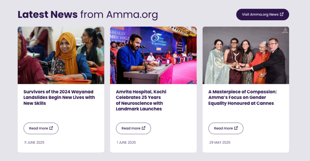
mobile-violet-bkg // This is used on Humanitarian and Spiritual Practices because the cards are split part way onto a white/violet background, but that does not line up on mobile so we make the entire background violet.
mobile-logo // this will make the logo height 54px on mobile. Put this class on the logo IMAGE BLOCK in header and footer (do not use the “Site Logo” block). Be sure to set the image height to 70px (for desktop to display correctly) and DO NOT set a width.
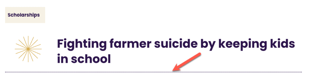
dotted-border // will change a solid border to a fitted border but if you don’t want a border on all sides you must set the non-border sides to ZERO in the block panel. Normally we use this on top or bottom borders only, like on project pages, and the border width should be 2px on project pages.
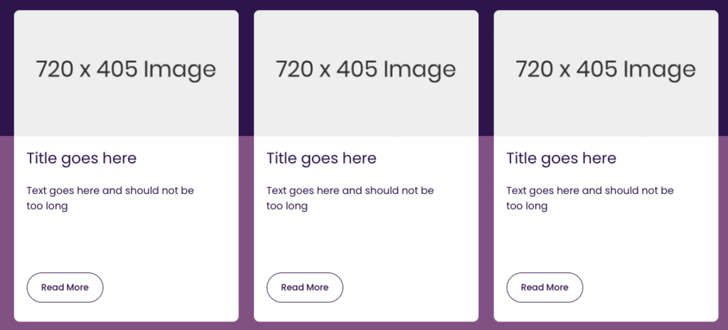
card-height-300, card-height-350, card-height-400, card-height-450, card-height-500, card-height-525, card-height-540 // These are MINIMUM HEIGHTS and used on the STACK of a card. Gutenberg does not allow you to set a minimum height AND a height at the same time, so we need these styles to set min-height:300px; height:100% (for example). This ensures the cards are 100% of their container but at least a certain number of pixels. See ChatGPT discussion here.
In this example below the cards have two classes: card-height-500 rounded-corners
vertical-dots-ivory, vertical-dots-white, vertical-dots-violet, vertical-dots-gold // apply to a group with 100% height within a center column. Example:
accordion-group // Designed for DARK backgrounds with white text. Used to get CSS and JS when turning a collection of detail blocks into an accordion that closes inactive content. On the GROUP that holds all the DETAILS blocks, add this style and set text color to WHITE.
accordion-group and ag-light // Designed for LIGHT backgrounds with dark purple text text. On the GROUP that holds all the DETAILS blocks, add these two styles (no need to set text color because the default is dark purple).
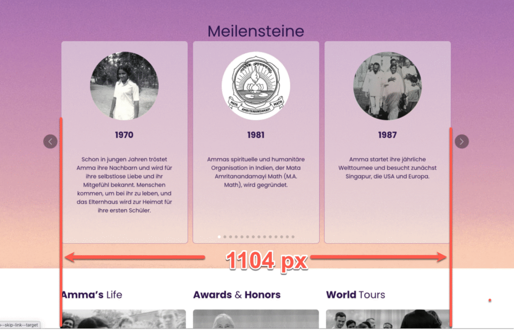
slider-parent // used to make the GutSlider Flexible container 1220 px wide so the navigation outside the slider goes beyond the 1104px site width (so slides themselves are 1104 px wide). The slider (Flexible) must be set to “Full Width” and must be inside a Group set to None for width and that Group needs this class.
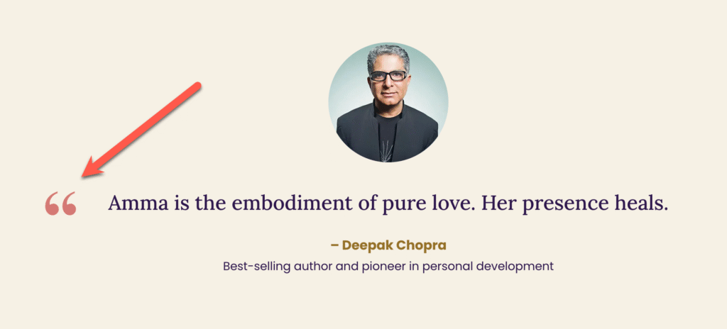
quote-outside // This is applied to the PARAGRAPH block that holds the big quote text. It uses the pseudo class ::before to insert the quote mark, so DO NOT type the quote mark.
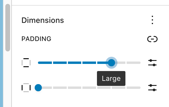
is-style-amma-purple-stars-background // this adds the stars background and it is selectable as a style in the editor for Group Blocks only. The important thing is to have the “Large” padding-top for the group.
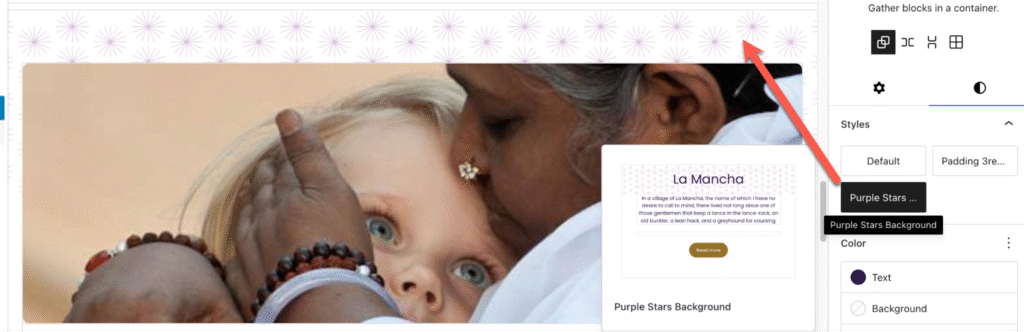
The top padding is hard-coded in the style, but that can be overwritten by the block settings, so if it looks messed up either 1) reset the block padding (reset, not none) or 2) set the top padding to Large.
Note: There are other styles that can be selected in the Block Settings panel as well (files in the Styles>Blocks and Styles>Sections folders in the theme). Eventually they MAY be documented here but they are fairly self-explanatory.
Note: Generally the mobile breakpoint is {max-width: 767px} except for show/hide mobile nav in header, that’s {max-width: 768px} and there are some other special cases too.